
About
When you want to display widgets horizontally, I know it’s such a headache to edit the theme and repeat the numerous times of trial and error. If you feel the same way, this would save the time for you.
How It Works
Screenshots
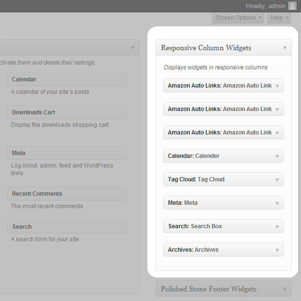
screenshot-1.jpg
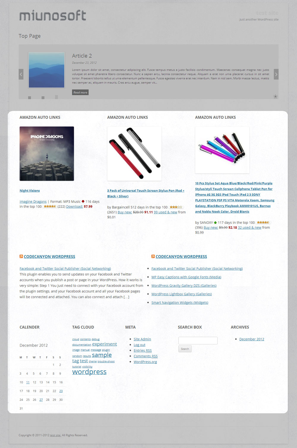
screenshot-2.jpg
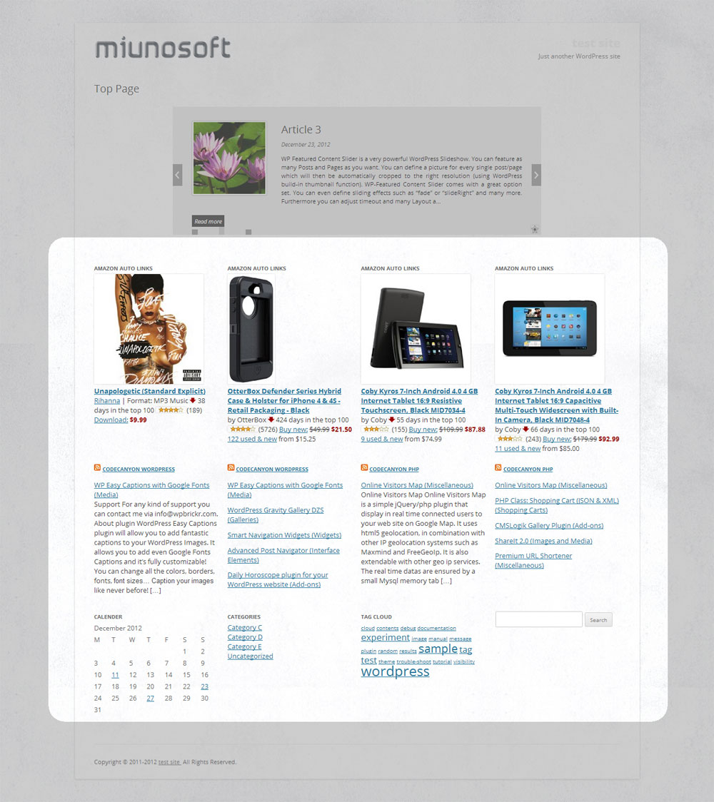
screenshot-3.jpg

screenshot-4.jpg
screenshot-5.jpg
screenshot-6.jpg

screenshot-7.jpg
Requirements
WordPress 3.2 or higher. PHP 5.2.4.
How To Use
Basic Three Steps
- Go to Appearance > Widgets. You’ll see a new custom sidebar box named Responsive Custom Widgets.,
- Add widgets to it.,
- To display the added widgets in a post, there are mainly two means.
- Option A: add the shortcode in a post.
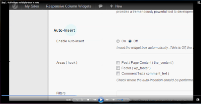
[responsive_column_widgets] - Option B: use the auto-insert feature by enabling the Enable Auto-insert option in the plugin setting page, New / Edit.
- Option A: add the shortcode in a post.
Specify Different Number of Columns in Each Row
By default, the widgets are displayed in 3 columns. It can be changed by setting the columns parameter.
[responsive_column_widgets columns="4"]
will display the widgets in 4 columns.
Optionally, if you like to change the number of columns in each row, use sequential numbers separated by commas.
For instance,
[responsive_column_widgets columns="3,2,5"]
will show the widgets in 3 columns in the first row, 2 columns in the second, and 5 to the third. Change the numbers accordingly for your needs.
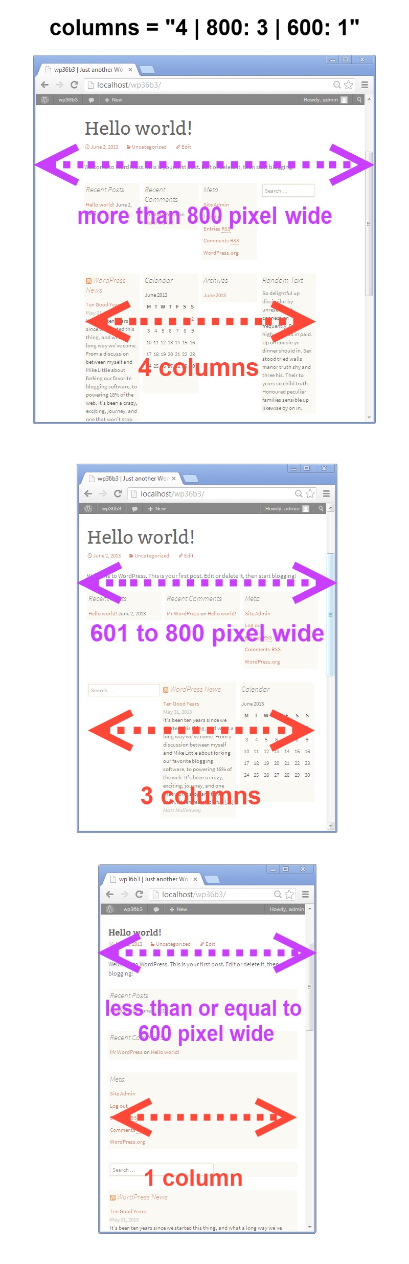
To set the number of columns for each screen max-width, use the pipe (|) character as the delimiter and place the width in pixel followed by a colon (:). Omit the width for no limitation. For instance,
[responsive_column_widgets columns="5 | 800: 4 | 600 : 2 | 480: 1"]
will show the widgets in 5 columns when the browser widths is greater than 800, and 4 when the browser width is 800 to 601, and 2 when the browser width is 600 to 481, and 1 when the browser width is less than or equal to 480.
Use PHP code for Themes
The widget box can be displayed outside post/pages. Putting a PHP code into the theme is one way of doing it. Use the ResponsiveColumnWidgets() function.
For instance,
|
1 |
<?php if ( function_exists( 'ResponsiveColumnWidgets' ) ) ResponsiveColumnWidgets( array( 'columns' => 5 ) ); ?> |
will display the widgets in 5 columns.
Parameters
There are other parameters besides columns.
- columns – the number of columns to show. Default: 3.If you want to specify the number of columns in each row, put the numbers separated by commas. For instance,
3, 2, 4would display 3 columns in the first row and 2 columns in the second row and four columns in the third row and so on. The rest rows follow the last set number.To set the number of columns by screen max-width, use the colon(:) character after the width, and use the pipe (|) character to delimit each set of number of columns. If the pixel is omitted, it is considered no limit. If the pipe delimiter is not present, the plugin will add 600: 1 internally by default.Format:
column value | pixel: column value | pixel: column valueThe following example displays widgets in 5 column when the browser width is greater than 800, and four when the width is 601 to 800, and three when the width is 481 to 600, and one when the width is 1 to 480.
e.g.
5 | 800: 4 | 600: 3 |480: 1 - sidebar – the ID of the sidebar to show. Default: responsive_column_widgets. For the twenty-twelve theme, sidebar-1, would show the default first sidebar contents.
- maxwidgets – the allowed number of widgets to display. Set 0 for no limitation. Default: 0.
- maxrows – the allowed number of rows to display. Set 0 for no limitation. Default: 0.
- omit – the numbers of the widget order of the items to omit, separated by commas. e.g. 3, 5 would skip the third and fifth registered widgets.
- showonly – the numbers of the widget order of the items to show, separated by commas. e.g. 2, 7 would only show the second and seventh registered widgets. Other items will be skipped.
- label – the label name of the widget box. Default: Responsive Column Widgets.
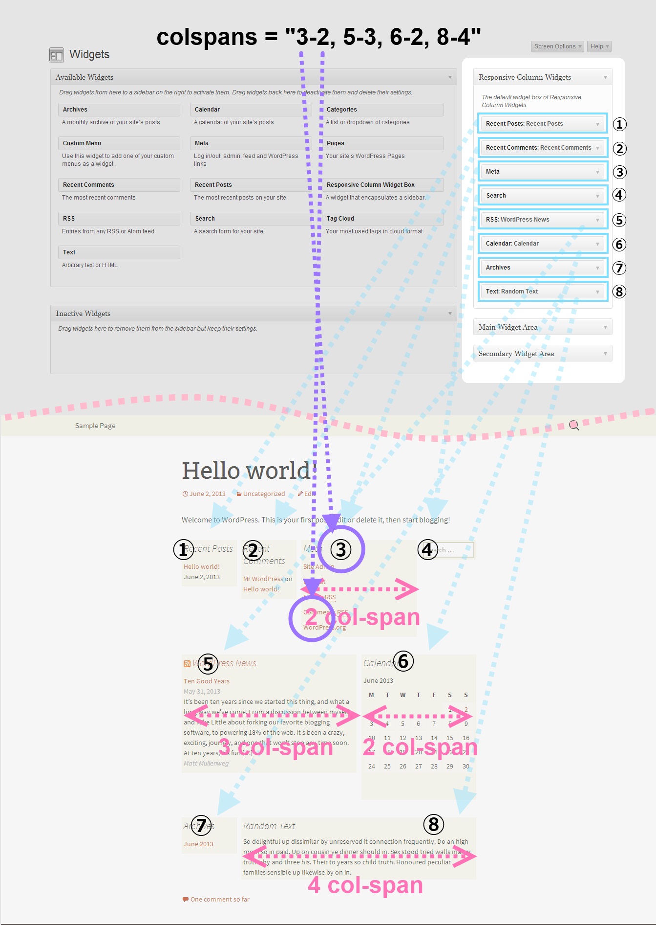
- colspans – the column spans. This determines how wide the specified widget item is.
1Format: widget index - column span, widget index - column span, widget index - column span, ...
The following parameter value of colspans will set the first widget with 3 column space and the fourth widget with two column space and the seventh takes four column space. Unspecified widget items will have one column span.
11-3, 4-2, 7-4To set them by screen max-width, like the columns parameter, use the colon(:) character after the width in pixel, and use the pipe (|) character to delimit each set of column spans. If the pixel is omitted, it is considered no limit. These widths need to correspond to the value passed to the columns parameter. e.g.
11-3, 4-2, 7-4 | 600: 1-2, 3-2, 7-3 | 480: 1-2If the column span exceeds the set number of max column, the column span will follow the max column. Note that the widget index of omitted widgets will not be considered(counted) in the widget index of this parameter.
- cache_duration – the cache lifespan in seconds which determines how long the cache remains. Default: 0. e.g.
3600 - call_id – this is for developers. This is used to identify the callback when a plugin hook is used so that the callback method assigned to the hook can know if it is theirs or not. This parameter does not affect the style based on the parameter values.
Render Custom Array in Multiple Columns
If you are a developer, you can render array contents that hold string values in multiple columns with responsive design.
Let’s take a look at an example. First, insert this shortcode in a post or a page.
|
1 |
[responsive_column_widgets call_id="days" columns="7"] |
The value for the call_id parameter can be any string that identifies the call.
Now we need to hook into the RCW_filter_widget_output_array filter so that we can intervene the process of plugin’s rendering widgets. It accepts two parameters. The first one will be the output array and the second one is the parameter array.
In the callback function for the filter, we check if the parameter call_id holds the correct value. You should change the value to suite your needs, which should be unique and not conflict with others.
|
1 2 3 4 5 6 7 8 9 10 11 |
add_filter( 'RCW_filter_widget_output_array', 'RCW_CustomArrayOutput', 10, 2 ); function RCW_CustomArrayOutput( $arrOutput, $arrParams ) { if ( ! isset( $arrParams['call_id'] ) ) return $arrOutput; if ( $arrParams['call_id'] == 'days' ) return array( 'Sunday', 'Monday', 'Tuesday', 'Wednesday', 'Thursday', 'Friday', 'Saturday' ); return $arrOutput; } |
This will display the days in 7 columns. The plugin will generate the CSS rules based on the parameter values. And the rules will be inserted inside the body tag.
If you like to insert the style in the head tag not the body tag, use the ResponsiveColumnWidgets_EnqueueStyle function. Tell the function which parameters are going to be used.
|
1 2 3 4 5 6 |
add_filter( 'wp_loaded', 'RCW_CustomArrayAddStyle' ); function RCW_CustomArrayAddStyle() { if ( function_exists( 'ResponsiveColumnWidgets_EnqueueStyle' ) ) { ResponsiveColumnWidgets_EnqueueStyle( array( 'columns' => "7" ) ); } } |
Note that 'call_id' => 'days' can be omitted. The other parameters should not be omitted.
For cases that the shortcode is not used, you can use the ResponsiveColumnWidets() function.
|
1 2 3 |
$arrYourArray = array( 'a', 'b', 'c', 'd' ); if ( function_exists( 'ResponsiveColumnWidets' ) ) ResponsiveColumnWidets( array( 'columns' => 4 ), $arrYourArray ); |
This will output a, b, c, d in four columns.
Video Tutorials
http://en.michaeluno.jp/responsive-column-widgets/video-tutorials/
Sponsored Links
Download
- responsive-column-widgets.zip
Support
If you find a bug in the program, please report it from the bug report page. For a feature request or a question on how to operate the program, please comment below.
Is it possible to create multiple widget boxes?
Finally, Responsive Column Widgets Pro is out!
Information
If you find the plugin useful, please rate it at wordpress.org so that others can know it.
Do you have a portfolio web site using this plugin? Let us know if your site can be linked from the plugin description pages ( this page or wordpress.org ) so that people can know how it is used in a live site.


