
About
When you want to display widgets horizontally, I know it’s such a headache to edit the theme and repeat the numerous times of trial and error. If you feel the same way, this would save the time for you.
How It Works
Screenshots
screenshot-1.jpg
screenshot-2.jpg
screenshot-3.jpg

screenshot-4.jpg
screenshot-5.jpg
screenshot-6.jpg

screenshot-7.jpg
Requirements
WordPress 3.2 or higher. PHP 5.2.4.
How To Use
Basic Three Steps
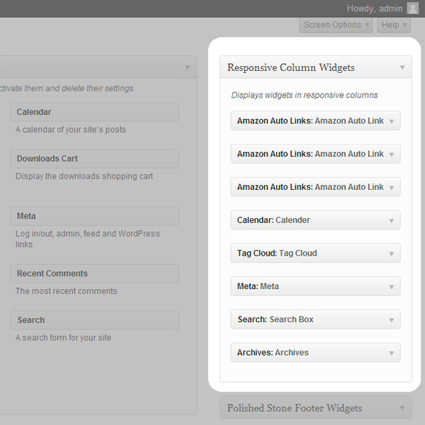
- Go to Appearance > Widgets. You’ll see a new custom sidebar box named Responsive Custom Widgets.,
- Add widgets to it.,
- To display the added widgets in a post, there are mainly two means.
- Option A: add the shortcode in a post.
[responsive_column_widgets] - Option B: use the auto-insert feature by enabling the Enable Auto-insert option in the plugin setting page, New / Edit.
- Option A: add the shortcode in a post.
Specify Different Number of Columns in Each Row
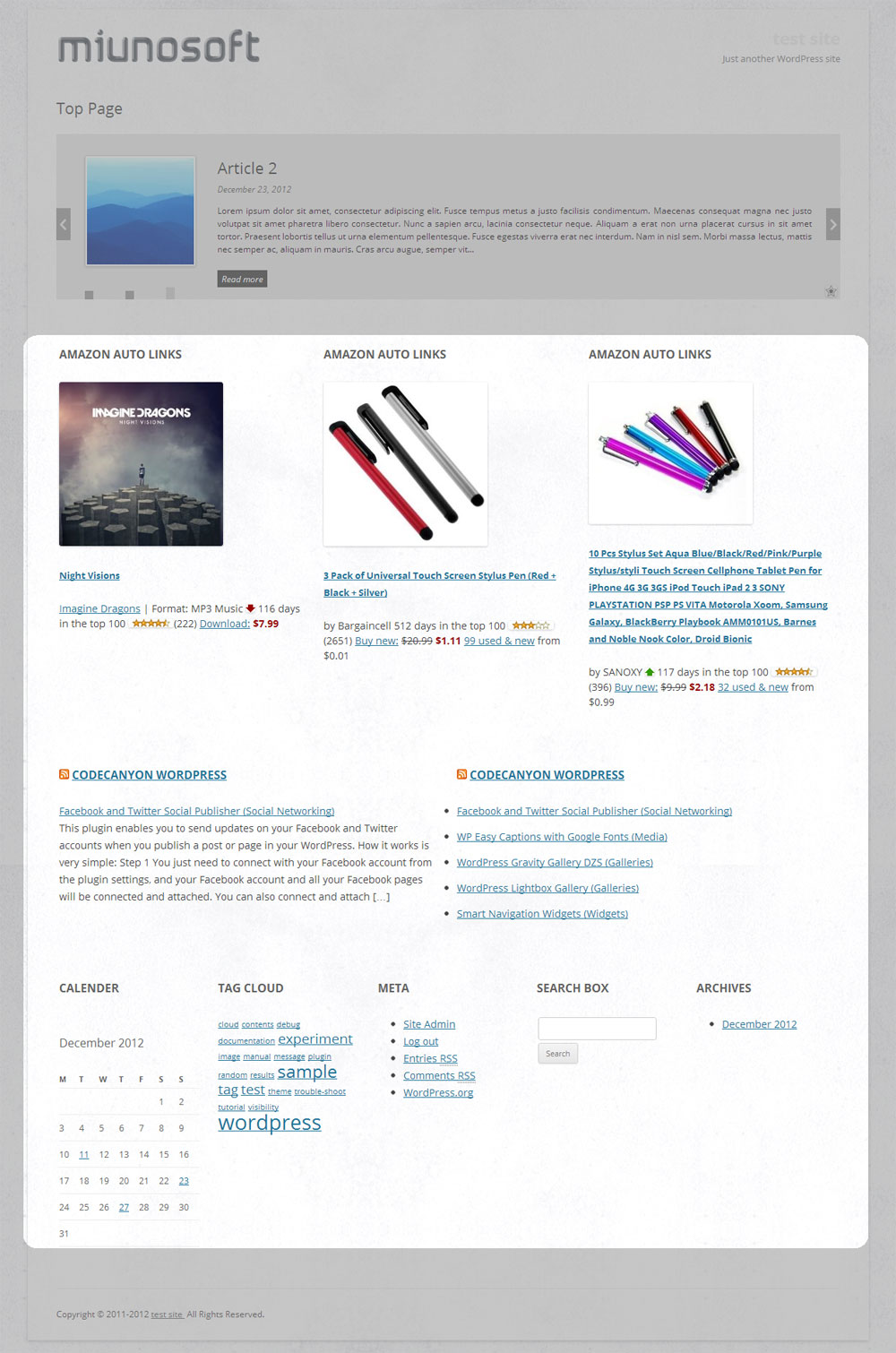
By default, the widgets are displayed in 3 columns. It can be changed by setting the columns parameter.
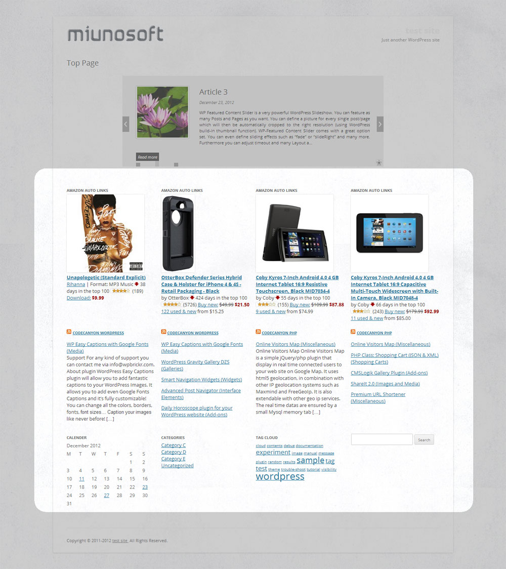
[responsive_column_widgets columns="4"]
will display the widgets in 4 columns.
Optionally, if you like to change the number of columns in each row, use sequential numbers separated by commas.
For instance,
[responsive_column_widgets columns="3,2,5"]
will show the widgets in 3 columns in the first row, 2 columns in the second, and 5 to the third. Change the numbers accordingly for your needs.
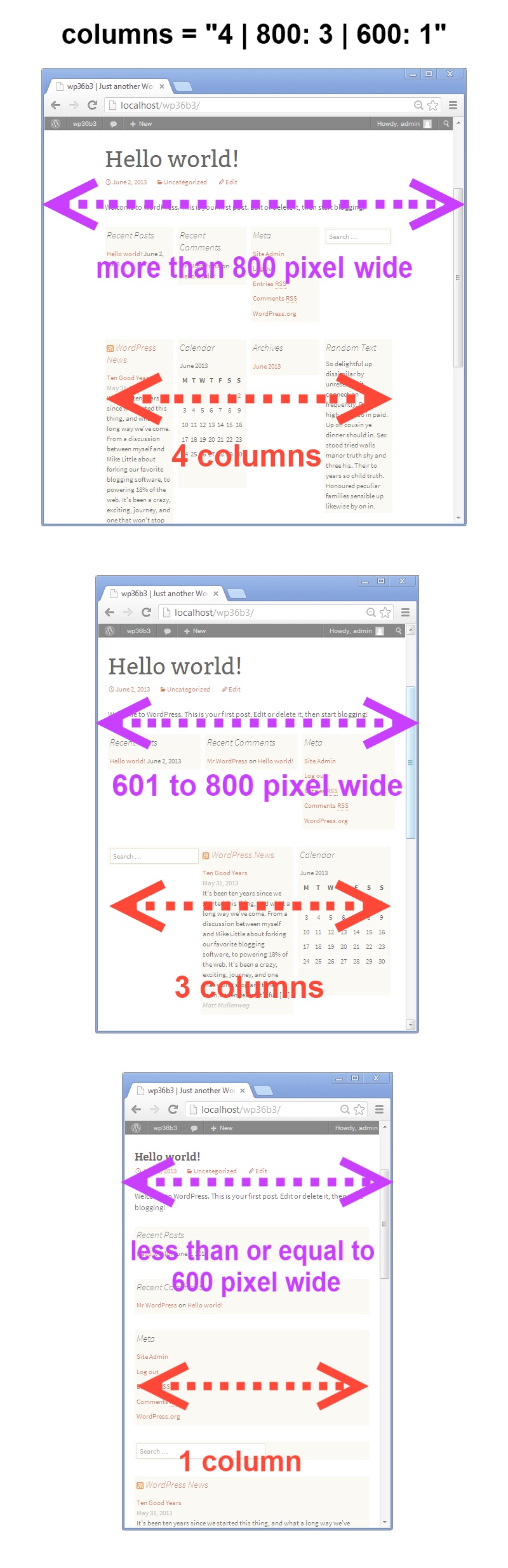
To set the number of columns for each screen max-width, use the pipe (|) character as the delimiter and place the width in pixel followed by a colon (:). Omit the width for no limitation. For instance,
[responsive_column_widgets columns="5 | 800: 4 | 600 : 2 | 480: 1"]
will show the widgets in 5 columns when the browser widths is greater than 800, and 4 when the browser width is 800 to 601, and 2 when the browser width is 600 to 481, and 1 when the browser width is less than or equal to 480.
Use PHP code for Themes
The widget box can be displayed outside post/pages. Putting a PHP code into the theme is one way of doing it. Use the ResponsiveColumnWidgets() function.
For instance,
|
1 |
<?php if ( function_exists( 'ResponsiveColumnWidgets' ) ) ResponsiveColumnWidgets( array( 'columns' => 5 ) ); ?> |
will display the widgets in 5 columns.
Parameters
There are other parameters besides columns.
- columns – the number of columns to show. Default: 3.If you want to specify the number of columns in each row, put the numbers separated by commas. For instance,
3, 2, 4would display 3 columns in the first row and 2 columns in the second row and four columns in the third row and so on. The rest rows follow the last set number.To set the number of columns by screen max-width, use the colon(:) character after the width, and use the pipe (|) character to delimit each set of number of columns. If the pixel is omitted, it is considered no limit. If the pipe delimiter is not present, the plugin will add 600: 1 internally by default.Format:
column value | pixel: column value | pixel: column valueThe following example displays widgets in 5 column when the browser width is greater than 800, and four when the width is 601 to 800, and three when the width is 481 to 600, and one when the width is 1 to 480.
e.g.
5 | 800: 4 | 600: 3 |480: 1 - sidebar – the ID of the sidebar to show. Default: responsive_column_widgets. For the twenty-twelve theme, sidebar-1, would show the default first sidebar contents.
- maxwidgets – the allowed number of widgets to display. Set 0 for no limitation. Default: 0.
- maxrows – the allowed number of rows to display. Set 0 for no limitation. Default: 0.
- omit – the numbers of the widget order of the items to omit, separated by commas. e.g. 3, 5 would skip the third and fifth registered widgets.
- showonly – the numbers of the widget order of the items to show, separated by commas. e.g. 2, 7 would only show the second and seventh registered widgets. Other items will be skipped.
- label – the label name of the widget box. Default: Responsive Column Widgets.
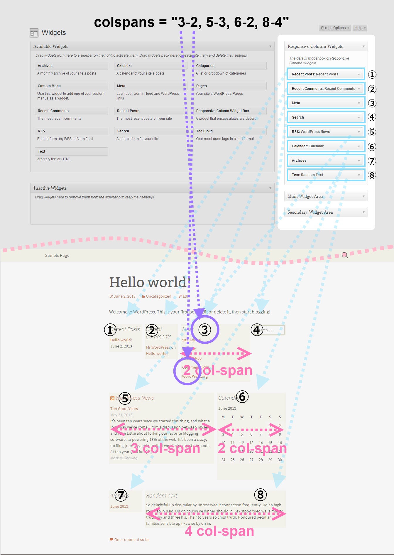
- colspans – the column spans. This determines how wide the specified widget item is.
1Format: widget index - column span, widget index - column span, widget index - column span, ...
The following parameter value of colspans will set the first widget with 3 column space and the fourth widget with two column space and the seventh takes four column space. Unspecified widget items will have one column span.
11-3, 4-2, 7-4To set them by screen max-width, like the columns parameter, use the colon(:) character after the width in pixel, and use the pipe (|) character to delimit each set of column spans. If the pixel is omitted, it is considered no limit. These widths need to correspond to the value passed to the columns parameter. e.g.
11-3, 4-2, 7-4 | 600: 1-2, 3-2, 7-3 | 480: 1-2If the column span exceeds the set number of max column, the column span will follow the max column. Note that the widget index of omitted widgets will not be considered(counted) in the widget index of this parameter.
- cache_duration – the cache lifespan in seconds which determines how long the cache remains. Default: 0. e.g.
3600 - call_id – this is for developers. This is used to identify the callback when a plugin hook is used so that the callback method assigned to the hook can know if it is theirs or not. This parameter does not affect the style based on the parameter values.
Render Custom Array in Multiple Columns
If you are a developer, you can render array contents that hold string values in multiple columns with responsive design.
Let’s take a look at an example. First, insert this shortcode in a post or a page.
|
1 |
[responsive_column_widgets call_id="days" columns="7"] |
The value for the call_id parameter can be any string that identifies the call.
Now we need to hook into the RCW_filter_widget_output_array filter so that we can intervene the process of plugin’s rendering widgets. It accepts two parameters. The first one will be the output array and the second one is the parameter array.
In the callback function for the filter, we check if the parameter call_id holds the correct value. You should change the value to suite your needs, which should be unique and not conflict with others.
|
1 2 3 4 5 6 7 8 9 10 11 |
add_filter( 'RCW_filter_widget_output_array', 'RCW_CustomArrayOutput', 10, 2 ); function RCW_CustomArrayOutput( $arrOutput, $arrParams ) { if ( ! isset( $arrParams['call_id'] ) ) return $arrOutput; if ( $arrParams['call_id'] == 'days' ) return array( 'Sunday', 'Monday', 'Tuesday', 'Wednesday', 'Thursday', 'Friday', 'Saturday' ); return $arrOutput; } |
This will display the days in 7 columns. The plugin will generate the CSS rules based on the parameter values. And the rules will be inserted inside the body tag.
If you like to insert the style in the head tag not the body tag, use the ResponsiveColumnWidgets_EnqueueStyle function. Tell the function which parameters are going to be used.
|
1 2 3 4 5 6 |
add_filter( 'wp_loaded', 'RCW_CustomArrayAddStyle' ); function RCW_CustomArrayAddStyle() { if ( function_exists( 'ResponsiveColumnWidgets_EnqueueStyle' ) ) { ResponsiveColumnWidgets_EnqueueStyle( array( 'columns' => "7" ) ); } } |
Note that 'call_id' => 'days' can be omitted. The other parameters should not be omitted.
For cases that the shortcode is not used, you can use the ResponsiveColumnWidets() function.
|
1 2 3 |
$arrYourArray = array( 'a', 'b', 'c', 'd' ); if ( function_exists( 'ResponsiveColumnWidets' ) ) ResponsiveColumnWidets( array( 'columns' => 4 ), $arrYourArray ); |
This will output a, b, c, d in four columns.
Video Tutorials
http://en.michaeluno.jp/responsive-column-widgets/video-tutorials/
Sponsored Links
Download
- responsive-column-widgets.zip
Support
If you find a bug in the program, please report it from the bug report page. For a feature request or a question on how to operate the program, please comment below.
Is it possible to create multiple widget boxes?
Finally, Responsive Column Widgets Pro is out!
Information
If you find the plugin useful, please rate it at wordpress.org so that others can know it.
Do you have a portfolio web site using this plugin? Let us know if your site can be linked from the plugin description pages ( this page or wordpress.org ) so that people can know how it is used in a live site.


I am using the Responsive Column Widgets on my web site at: http://moveindenver.com/property-search/ There is too much space at the bottom of the graphics. Is there a way to tighten it up?
Some p tags are causing bottom margins as I read your web site HTML code. One is at the bottom of your each widget. Another is at the end of the widget box and it is enclosing the plugins’s HTML comment embedded at the end of the widget box.
How did you display the widget box, with shorcode, PHP function, or auto-insert?
I inserted it with shortcode: [responsive_column_widgets columns="5 | 800: 4 | 600 : 2 | 480: 2"]
This is one of the image HTML that I used to create the widget in Responsive Column Widgets:
Check the image widget you are using if it contains an unnecessary p tag at the bottom. Remove any extra lines inserted in the widget. I’m roughly guessing that you are using a plugin or theme that applies a filter to convert line breaks to p tags. I suggest you narrow down the cause of the p tag conversion, that includes switching themes and deactivating some plugins to see the results.
Meanwhile, you may just try auto-insert. Set Enable Auto-insert On and check Home / Front Page in Limit Auto-Insert to Checked Page Types to only enable it on the home page.
The images are all coming from the Media Gallery of the wordpress site with no P-Tags that I can see. The default settings are as you suggested. Nothing has changed. Changing the Theme is out of the question. Any other ideas? I really appreciate your help.
Try Auto Insert.
The Auto Insert is enabled for Post/Page limited for the Home/Front Page. Thoughts?
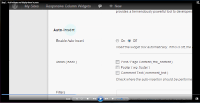
Make sure you have the settings as follows.
Auto-Insert
Enable Auto-insert: On
Area(hook) : Post/Page Contents
Limit Auto-Insert to Checked Page Types: Home / Front Page
Limit Auto-Insert to Checked Post Types: Post, Page ( check these )
If the auto insert is working, you don’t need the shortcode.
Thank you for this great plugin!
It works like a charm in Firefox, Safari and IE 10, however I’ve got display issue with IE 9 and lower versions of IE.
My website is sbi-global.com/test
In IE9, the widgets are not placed in columns for some reason. You can find the screenshot here: http://jabezexpression.ca/jabezpictures/screenshots.jpg
I appreciate your help on this 🙂
Thanks,
Si
Hi,
It looks like the issue described here. According to them IE 9 or bellow cannot support more than 32 stylesheets in a page. The first loaded 31 or 32 items take effect and the rest will be ignored. As your site has many stylesheets and since the plugin’s styles are loaded at the end of the head tag, the plugin’s ones are ignored. As I tested with your web page, it applies not only to < link > tags with the stylesheet property but also < style > tags.
The suggested solution from the linked topic is:
So I think you should consult the theme developer if he/she can handle that.
I’ll keep this issue in mind and see if I can reduce the number of style tags that the plugin generates.
Hope it helps!
Hi, great plugin, exactly what I was trying to accomplish using TWO other plugins, and a lot of hassle…BUT…I’m so close to getting it to work, but not quite!
I have three widgets loaded, and using shortcode to display on a page. I have left all column settings at default, and expected the three widgets to split the available width in thirds. Instead, they are very narrow, and all to one side. I have set a grey background color and can see that the box is full width. I have uploaded a screenshot here:
http://www.ravensong.biz/widgets.jpg
Can you tell what is going on?
Thank you!
Can I see the live site?
Looks like the plugin is not working well with your theme. If it is a free theme, you can tell which one and I can test it on my environment.
I watched the video tutorial about how to exclude certain pages from the auto insert of the widget boxes, but the numbers for the page/post id are not saved when I click the save changes button… What am I doing incorrectly?
Hi Don,
Thanks for the report. That is a bug. Comma delimited inputs get lost in the sanitization process. This bug seems to have started occurring since v1.1.7.
Please try this development version http://downloads.wordpress.org/plugin/responsive-column-widgets.zip and let me know if the problem still persists.
That did it — thank you!
You are welcome!
Aloha!
Great Plugin! Will you be updating plugin any time soon so that it is compatible with WordPress 3.6?
Hi Jessica,
It should be already compatible with WordPress 3.6.
Are you encountering a problem? If so, you can post the issue here.
First of all, this plugin is a brilliant solution to an annoying problem! I’m having one issue though – at low resolutions I have the columns appear on two rows, and the vertical gap created between the two rows is far too large. I haven’t set up any padding in the settings so it should all be zero – how would I go about fixing this please?
Thank you!
I guess,
You may try putting the above rule in the CSS Rule option textarea field. You mentioned, at low resolutions, so if it should only apply to, for instance, the 600px screen width or lower, change it to,
( Change the 600px part accordingly for your needs )
That’s great – thank you so much. Sorry – should have figured that out…
You are welcome! Please take the time to review the plugin if you like it. Thank you!
Hullo,
In my responsive pro theme I did’nt have a nice footer so I decided to use column widgets to get it done.
The footer is ok i just need to center it.
Setting the .widget margin to something is not an elegant enough solution (when You resize the browser window the footer get’s ugly)
I tried setting margin to auto in several spots but nogo …
Can You help ?
Cheers
Hi,
I think that to center the widget box with desired margins is a common problem the users encounter. I remember that I also needed to do something similar. So I added the settings for it.
Grab and try the development version: http://downloads.wordpress.org/plugin/responsive-column-widgets.zip
Assuming the linked web site in your name is the one you are working, I see you added the background color and the margin-left. Remove those and try the options in the New/Edit page, that are added to the new version.
Let me know if it works for you.
Can you tell me how to set spaces between the widgets in the rows. At the moment they are running together. I noticed there is an option for additional padding above or below but not side by side? Thanks
Hi,
Are you okay with using margins? If you need to insert white-space characters like
between the widgets, it won’t be easy.I’m not sure if this is what you are looking for but here is an example. You can put this in the Custom Style section of the New / Edit setting page.
Hi Thanks for the suggestion. In fact I realized the problem was because the settings were at default for 3 columns and there was only really space for 2. When I altered the setting from 3 to 2 it automatically spaced the items out correctly.
Adrian
Glad to hear you sorted it out!
Hello Michael, taking the opportunity to congratulate you for the beautiful work of the plugin
Responsive Column Widgets 1.1.4. I use wordpress 3.51, and loved the plugIn .. but need to know .. why the toolbar does not appear on my theme .. broke the plugin, or am I broken? and breaking the plugin ..! have any instruction else? / strong hug and wish you lots of light ..
sorry my english, I’m a fugitive from school here in Brazil .. Sincerely ..
Claudio Gonçalves Octa’Linea
Hi Claudio,
Thanks for the nice words and the hug!
The Admin bar (toolbar) should not be disabled with the plugin. Can you test if it occurs only when the plugin is activated?
The facebook like box is a widget which I would like to have on top of the column below the like box.
Thus I would be in heaven if I could manage which column a widget belong to and control position.
It would be nice if I also could use the parameters for the php function in the shortcode.
It´s fantastic plugin, btw.
Hi, thanks for the complement.
I’m having hard time understanding what you mean. Can you elaborate?
For the first request, the widgets are placed in columns in the order of what the widgets are added to the plugin’s custom sidebar box. So basically you are specifying the positions of the widgets when you add them in the sidebar box.
For the second request, you can pass the parameters to the PHP function, ResponsiveColumnWidgets(), like you do with the shortcode. It accepts the parameters as array. That’s the only thing that differs from the shortcode.
how would i get a row to show each widget in a different width?
example
column 1 20% |column 2 70% |column 3 20%
You would need to set a custom CSS style for it.
If the number of columns is three, then you may try setting the following rules in the Custom Styles option. The sum of the total width percentages should not exceed 96.6%.
Thank you it helped alot. but now i have a new question. how would i get multiple wedgets in one area and not the other.
example
1 widget | 3 widgets | 1 widget
thanks for your fast response.
That’s something I’ve never thought about. It’s going to be a little bit tricky.
I assume you are a Pro user and can create multiple widget boxes.
You may try this. You create two widget boxes: one is like, 1 widget | 1 widget | 1 widget; the other one also consists of three widgets (as you desire) 1 widget | 1 widget | 1 widget.
1. Get and install the Shortcode Exec PHP plugin. http://wordpress.org/extend/plugins/shortcode-exec-php/ and enable the option, Execute shortcodes in (sidebar) widgets in the installed plugin’s setting page.
2. Create a new widget box A with three widgets with three columns.
3. Create a new widget box B with three widgets with three columns. ( I say three because you showed 3 widgets in your example )
4. Create a text widget and insert the shortcode of the widget box B.
5. Add the text widget to be the widget box A’s second widget.
I suppose this would do what you are looking for but I have not tested it.
With v1.1.3, this can be achieved without a third party plugin. You can use the newly added plugin’s widget.
I was wondering if it was possible to have these widgets show up only on the home page of the website instead of all of them.
Yes, it’s possible. Check out this video. http://www.youtube.com/watch?v=-2hjmOJgF60
Is there a way to center the header of the columns or center the whole thing with the column headers?
Thank you
I don’t quite get the question. Can you explain it with a picture?
Hi,
How can I indent the columns so that they line up with the built-in 4 column array above? (see http://www.improvethrumovement.com)
Where exactly do I add the code you’ll give me? (I’m a total newbie..)
Hi,
I’m having hard time understanding what you are trying to achieve.
To indent an HTML element, usually margin-left or padding-left in the CSS rule will be used but you sound that you are not looking for a way with CSS, I guess.
To use the plugin responsive widgets, we have mainly two ways. One is to use PHP code in the theme. The other is to use the shortcode in a page/post. Which one do you prefer?
Hi, Thanks for responding – I thought that it might be achieved through margin or padding, but it seems like that only was putting space between the middle of the columns, as opposed to adding distance between the outer columns and the edge of the screen. Maybe I was typing it in the wrong place… CSS is fine, and that’s great if it would work by typing in a padding number.. would I place it in “styles” or the “index” or maybe you know of an easier way.
I’m a total noob and this is my first website so thanks for being patient.
Hi, I’m really having hard time understanding what you are trying to achieve. Can you upload a screenshot that shows how the site layout should look like along with the current layout which you think it’s not working?
yes… http://themeforest.net/item/fit-fitnessgym-responsive-wordpress-theme/full_screen_preview/3407694
that preview is my theme. I’m trying to recreate the area below their full horizontal ad where they have the headings “Recent News” “Our Trainers” “Our classes”
As you can see, the three columns for their headings are bumped in from the left and right sides of the page.
On my website http://www.improvethrumovement.com/ , the columns “Upcoming events” “Our Instructors” and “our classes” run the whole way to the left and right edge..
or.. maybe there’s something I can type into the box under “edit” when you’re in the responsive column’s manage page
Okay – better description. I can modify the margin, and that works, but it is applying the margin to the left and right side of each column. Can I apply a margin to only the outer two columns? The leftmost column would get a margin on the left side, and the rightmost column would have a margin on it’s right side.
Try putting the following rule in the style option in the setting page.
If that doesn’t work, try adding it in your style.css of your theme.
that worked PERFECTLY! Do you know how I could make the tan color continue all the way down behind the widget, rather than it’s background being white? If I enter a background color, it colors the widget, but not the outer margins.
You’re so helpful!
I guess.
Jacqueline, this is not an issue of the plugin but the theme so I suggest you ask to the theme author.
It would be appreciated if you could take time to write a comment on the review page. http://wordpress.org/support/view/plugin-reviews/responsive-column-widgets
Regards,
Hi Mich…I am so sorry your plugins seem doesn’t run on my site…
let me test it onto my new site
Hello,
Please describe your problem in detail. Was it working before and now it doesn’t with the new version?
Also make sure you added widgets to the custom sidebar that the plugin creates via Appearance -> Widgets. Then place a shortcode like
I am using the theme atahualpa which is wonderful. It lets me design my sidebar widgets to a certain way that I want to and automatically designs my widgets when i choose which ones to use.. However, when i use this plugin and add the widget columns to my home page, they are showing very plainly. Is there any way that I can have them look the same way I have my sidebar widgets look?
There is a way but it has to be done manually by adding the rules to your theme’s style.css.
The new version 1.0.2 is up. It should solve this issue.
Hi there,
Terrific plugin – thanks so much. One question, though. Is there a way to increase the space between columns? They seem too close together for me!
Regards,
Valerie
Hi,
Adding the following CSS rule in your theme’s style.css will do the job. Change the values set to the margins for your needs.
Hope it helps!
Hi, I am using responsive column for my main page @ http://www.youthlobby.org
For some reason, the first text widget (in the first column i mean) is tiny compared to the others. I need help to sort this out ASAP!
The site is being rolled out in 3 days time. I need a solution quickly. I hope you guys can help.
Hi, can you upload a screenshot and mark the part having the problem? I could not get which part of the page you are talking about.
Im trying to create two different sets of columns on two different pages using the OMIT and SHOWONLY parameters (i.e. OMIT 1,2,3 on one page and SHOWONLY 1,2,3 on the other. It doesn’t seem to be working – care to give me a hand with the shortcode?
Actually I have it all set now – using these two shortcodes:
[responsive_column_widgets columns="3" showonly="1,2,3"]
[responsive_column_widgets columns="1,4,1,3" omit="1,2,3"]
Hope that can help someone!
Glad to hear you sorted it out!
Hi Michael – great plugin…we appreciate it. How do you create multiple Responsive Custom Widgets boxes to control DIFFERENT content column content on DIFFERENT pages? http://screencast.com/t/070N8sdqMEFb – instead of just being able to add the SAME column content to MULTIPLE pages.
Thanks ~ Emil
Creating multiple widget boxes is currently not supported but it may be implemented in a future release.
Thank you, sir.